扫码一下
查看教程更方便
警报框经常用于突出需要最终用户立即注意的信息,例如警告、错误或确认消息。
使用 Bootstrap,我们可以通过将上下文类(例如,.alert-success、.alert-warning、.alert-info 等)添加到 .alert 基类,轻松地为各种目的创建优雅的警报消息。 您还可以添加一个可选的关闭按钮来关闭任何警报。
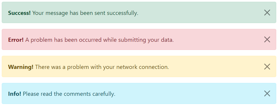
Bootstrap 提供总共 8 种不同类型的警报。 以下示例将向您展示最常用的警报,它们是:success、error或danger、warning和 info 警报。
<!-- Success Alert -->
<div class="alert alert-success alert-dismissible fade show">
    <strong>Success!</strong> Your message has been sent successfully.
    <button type="button" class="btn-close" data-bs-dismiss="alert"></button>
</div>

<!-- Error Alert -->
<div class="alert alert-danger alert-dismissible fade show">
    <strong>Error!</strong> A problem has been occurred while submitting your data.
    <button type="button" class="btn-close" data-bs-dismiss="alert"></button>
</div>

<!-- Warning Alert -->
<div class="alert alert-warning alert-dismissible fade show">
    <strong>Warning!</strong> There was a problem with your network connection.
    <button type="button" class="btn-close" data-bs-dismiss="alert"></button>
</div>

<!-- Info Alert -->
<div class="alert alert-info alert-dismissible fade show">
    <strong>Info!</strong> Please read the comments carefully.
    <button type="button" class="btn-close" data-bs-dismiss="alert"></button>
</div>
上述代码结果如下所示
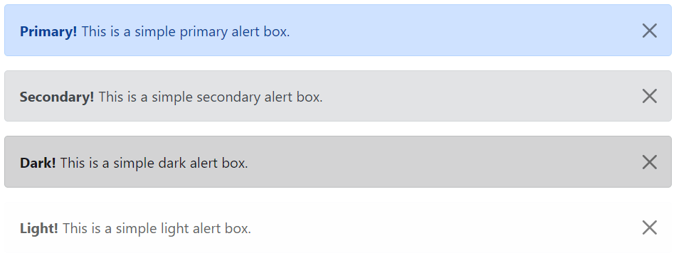
以下是可用于各种目的的其余四个 Bootstrap 警报。
<!-- Primary Alert -->
<div class="alert alert-primary alert-dismissible fade show">
    <strong>Primary!</strong> This is a simple primary alert box.
    <button type="button" class="btn-close" data-bs-dismiss="alert"></button>
</div>

<!-- Secondary Alert -->
<div class="alert alert-secondary alert-dismissible fade show">
    <strong>Secondary!</strong> This is a simple secondary alert box.
    <button type="button" class="btn-close" data-bs-dismiss="alert"></button>
</div>

<!-- Dark Alert -->
<div class="alert alert-dark alert-dismissible fade show">
    <strong>Dark!</strong> This is a simple dark alert box.
    <button type="button" class="btn-close" data-bs-dismiss="alert"></button>
</div>

<!-- Light Alert -->
<div class="alert alert-light alert-dismissible fade show">
    <strong>Light!</strong> This is a simple light alert box.
    <button type="button" class="btn-close" data-bs-dismiss="alert"></button>
</div>
上面示例显示结果如下
提示: .alert 元素上的 .fade 和 .show 类在关闭警报框时启用淡入淡出过渡效果。 如果您不想要动画,只需删除这些类。 此外,为了正确定位 .btn-close,.alert 元素需要类 .alert-dismissible。 如果您的警报没有关闭按钮,您可以跳过该课程。
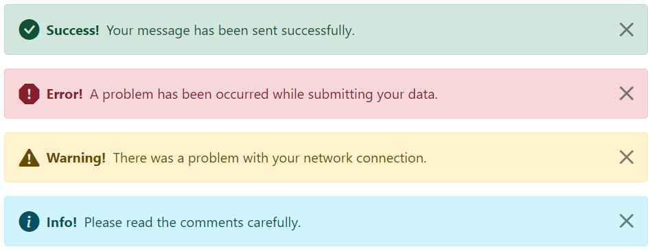
我们还可以在 Bootstrap 警报中放置图标。 可以使用 Bootstrap 图标或第三方图标,例如 Font Awesome。 让我们看一下下面的例子:
<div class="alert alert-warning alert-dismissible d-flex align-items-center fade show">
    <i class="bi-exclamation-triangle-fill"></i>
    <strong class="mx-2">Warning!</strong> There was a problem with your network connection.
    <button type="button" class="btn-close" data-bs-dismiss="alert"></button>
</div>

<!-- Info Alert -->
<div class="alert alert-info alert-dismissible d-flex align-items-center fade show">
    <i class="bi-info-circle-fill"></i>
    <strong class="mx-2">Info!</strong> Please read the comments carefully.
    <button type="button" class="btn-close" data-bs-dismiss="alert"></button>
</div>
上面示例的结果如下所示
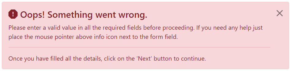
我们还可以在警报中放置其他 HTML 元素,例如标题、段落和分隔符。 要管理元素之间的间距,您可以使用边距实用程序类,如下所示:
<div class="alert alert-danger alert-dismissible fade show">
    <h4 class="alert-heading"><i class="bi-exclamation-octagon-fill"></i> Oops! Something went wrong.</h4>
    <p>Please enter a valid value in all the required fields before proceeding. If you need any help just place the mouse pointer above info icon next to the form field.</p>
    <hr>
    <p class="mb-0">Once you have filled all the details, click on the 'Next' button to continue.</p>
    <button type="button" class="btn-close" data-bs-dismiss="alert"></button>
</div>
上面示例的结果如下
您可以将实用程序类 .alert-link 应用于任何警报框内的链接,以快速创建匹配的彩色链接,如下例所示:
<div class="alert alert-warning alert-dismissible fade show">
    <strong>Warning!</strong> A simple warning alert with <a href="#" class="alert-link">an example link</a>.
    <button type="button" class="btn-close" data-bs-dismiss="alert"></button>
</div>
上面示例显示结果如下

data 属性提供了一种向警报框添加关闭功能的简单方法。
只需将 data-bs-dismiss="alert" 添加到关闭按钮,它将自动启用包含警报消息框的关闭。 此外,将类 .alert-dismissible 添加到 .alert 元素以正确定位 .btn-close 按钮。
<div class="alert alert-info alert-dismissible fade show">
    <strong>Note!</strong> This is a simple example of dismissible alert.
    <button type="button" class="btn-close" data-bs-dismiss="alert"></button>
</div>
使用 <button> 元素创建关闭按钮,以在所有设备上保持一致的行为。
我们还可以通过 JavaScript 关闭警报。 让我们尝试一个例子,看看它是如何工作的:
document.addEventListener("DOMContentLoaded", function(){
    var btn = document.getElementById("myBtn");
    var element = document.getElementById("myAlert");

    // 创建 alert 实例
    var myAlert = new bootstrap.Alert(element);

    btn.addEventListener("click", function(){
        myAlert.close();
    });
});