扫码一下
查看教程更方便
模态框基本上是一个对话框或弹出窗口,用于向用户提供重要信息或提示用户在继续下一步之前采取必要的操作。 模态框被广泛用于警告用户会话超时等情况或在执行任何关键操作(例如保存或删除重要数据)之前使他们进行最终的确认。
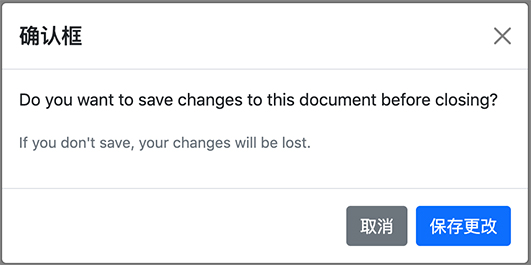
我们可以使用 Bootstrap 模态框插件轻松创建非常智能且灵活的对话框。 下面的示例概述了创建简单模态框的基本结构,该示例具有标题、消息正文和包含用户操作按钮的页脚。
<script>
$(document).ready(function() {
    $("#myModal").modal("show");
});
</script>

<div id="myModal" class="modal fade" tabindex="-1">
    <div class="modal-dialog">
        <div class="modal-content">
            <div class="modal-header">
                <h5 class="modal-title">确认框</h5>
                <button type="button" class="btn-close" data-bs-dismiss="modal"></button>
            </div>
            <div class="modal-body">
                <p>Do you want to save changes to this document before closing?</p>
                <p class="text-secondary"><small>If you don't save, your changes will be lost.</small></p>
            </div>
            <div class="modal-footer">
                <button type="button" class="btn btn-secondary" data-bs-dismiss="modal">取消</button>
                <button type="button" class="btn btn-primary">保存更改</button>
            </div>
        </div>
    </div>
</div>
如果我们尝试上面的示例,它会通过Javascript在 DOM 完全加载时自动启动模态窗口。 输出将如下所示:
提示:总是尽量将你的模态 HTML 放在文档的顶级位置,最好在关闭<body>标签(即</body>)之前,以避免其他元素的干扰,否则可能会影响模态的外观或功能 。
我们可以通过单击按钮或通过 data 属性的链接来激活 Bootstrap 模态框,而无需编写任何 JavaScript 代码。 看看下面的例子,看看它是如何工作的:
<!-- Button HTML (to Trigger Modal) -->
<a href="#myModal" class="btn btn-lg btn-primary" data-bs-toggle="modal">加载示例模态框</a>

<!-- Modal HTML -->
<div id="myModal" class="modal fade">
    <div class="modal-dialog">
        <div class="modal-content">
            <div class="modal-header">
                <h5 class="modal-title">确认框</h5>
                <button type="button" class="btn-close" data-bs-dismiss="modal"></button>
            </div>
            <div class="modal-body">
                <p>Do you want to save changes to this document before closing?</p>
                <p class="text-secondary"><small>If you don't save, your changes will be lost.</small></p>
            </div>
            <div class="modal-footer">
                <button type="button" class="btn btn-secondary" data-bs-dismiss="modal">取消</button>
                <button type="button" class="btn btn-primary">保存更改</button>
            </div>
        </div>
    </div>
</div>
要通过 data 属性激活 Bootstrap 模态框,我们基本上需要两个组件——控制器元素(如按钮或链接)和模态框元素本身。
其余的代码作用是很清晰的,例如 .modal-header 元素定义了一个模态框的标题,通常包含一个模态标题和一个关闭按钮,而 .modal-body 元素包含实际内容,如文本、图像、表单等等,并且 .modal-footer 元素定义了通常包含用户操作按钮的页脚。
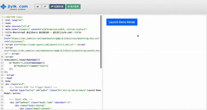
我们还可以通过 JavaScript 激活 Bootstrap 模态窗口——只需在 JavaScript 代码中使用模态 ID 或类选择器调用Bootstrap4的 modal() 方法。
$(document).ready(function() {
    $("#myBtn").click(function() {
        $("#myModal").modal("show");
    });
});
使用 .modal-dialog-centered 类可以使得模态框垂直居中对齐。如果模态框内有很长的内容,可以添加另一个类 .modal-dialog-scrollable 使模态框具有滚动条。 看下面的例子:
<!-- Button HTML (to Trigger Modal) -->
<a href="#modalCenter" role="button" class="btn btn-primary" data-bs-toggle="modal">Vertically Centered Modal</a>

<!-- Modal HTML -->
<div id="modalCenter" class="modal fade" tabindex="-1">
    <div class="modal-dialog modal-dialog-centered">
        <div class="modal-content">
            <div class="modal-header">
                <h5 class="modal-title"> 垂直对齐示例 </h5>
                <button type="button" class="btn-close" data-bs-dismiss="modal"></button>
            </div>
            <div class="modal-body">
                <p>Lorem ipsum dolor sit amet, consectetur elit...</p>
            </div>
            <div class="modal-footer">
                <button type="button" class="btn btn-secondary" data-bs-dismiss="modal">Close</button>
                <button type="button" class="btn btn-primary">OK, Got it!</button>
            </div>
        </div>
    </div>
</div>
我们还可以利用 Bootstrap4 网格系统在模态框中创建网格布局。 简单地说,在 .modal-body中使用 .row 类创建行并使用 .col-* 、.col-sm-* 、.col-md-* 、.col-lg-* 和 .col-xl-* 类。 让我们看一个例子:
<div id="myModal" class="modal fade" tabindex="-1">
    <div class="modal-dialog">
        <div class="modal-content">
            <div class="modal-header">
                <h5 class="modal-title">Send Us a Message</h5>
                <button type="button" class="btn-close" data-bs-dismiss="modal"></button>
            </div>
            <div class="modal-body">
                <div class="row">
                    <div class="col-6">
                        <div class="form-group">
                            <label>First Name</label>
                            <input type="text" class="form-control">
                        </div>
                    </div>
                    <div class="col-6">
                        <div class="form-group">
                            <label>Last Name</label>
                            <input type="text" class="form-control">
                        </div>
                    </div>
                </div>
                <div class="row">
                    <div class="col-12">
                        <div class="form-group">
                            <label>Email</label>
                            <input type="email" class="form-control">
                        </div>
                    </div>
                </div>
                <div class="row">
                    <div class="col-12">
                        <div class="form-group">
                            <label>Comments</label>
                            <textarea class="form-control"></textarea>
                        </div>
                    </div>
                </div>
            </div>
            <div class="modal-footer">
                <button type="button" class="btn btn-secondary" data-bs-dismiss="modal">Cancel</button>
                <button type="button" class="btn btn-primary">Send Email</button>
            </div>
        </div>
    </div>
</div>
有一些选项可以传递给Bootstrap4的 modal() 方法来自定义模态框的功能。 选项可以通过 data 属性或 JavaScript 传递。
要通过 data 属性设置模态框选项,只需将选项名称附加到 data-bs- ,例如 data-bs-backdrop="static"、data-bs-keyboard="false" 等。
| 名称 | 类型 | 默认值 | 描述 |
|---|---|---|---|
| backdrop | boolean 或者字符串'static' | true | 包括一个模态框背景(黑色覆盖区域)元素。 或者, 可以将背景指定为 static,该背景不会在单击时关闭模态。 |
| keyboard | boolean | true | 按下退出键时关闭模态窗口。 |
| focus | boolean | true | 初始化时将焦点聚焦在模态框上。 |
| show | boolean | true | 初始化或激活时显示模态框。 |
data 属性提供了一种设置模式选项的简单方法,但是 JavaScript 是更好的方法,因为它可以防止我们重复性的工作。 请参阅 Bootstrap4 Methods 部分中的传递选项的示例,了解如何使用 JavaScript 设置模态框选项。
在下面的示例中,我们将背景选项设置为静态,这可以防止在单击模态框外部(即黑色覆盖区域)时关闭模态窗口。
<!-- Button HTML (to Trigger Modal) -->
<button type="button" class="btn btn-lg btn-primary" data-bs-target="#myModal" data-bs-toggle="modal">Launch Demo Modal</button>

<!-- Modal HTML -->
<div id="myModal" class="modal fade" data-bs-backdrop="static" tabindex="-1">
    <div class="modal-dialog">
        <div class="modal-content">
            <div class="modal-header">
                <h5 class="modal-title">确认框</h5>
                <button type="button" class="btn-close" data-bs-dismiss="modal"></button>
            </div>
            <div class="modal-body">
                <p>Do you want to save changes to this document before closing?</p>
                <p class="text-secondary"><small>If you don't save, your changes will be lost.</small></p>
            </div>
            <div class="modal-footer">
                <button type="button" class="btn btn-secondary" data-bs-dismiss="modal">取消</button>
                <button type="button" class="btn btn-primary">保存修改</button>
            </div>
        </div>
    </div>
</div>