Use CSS to resize images while maintaining aspect ratio
This simple guide is all about setting up images in your website so that their aspect ratio is not disturbed based on the image size and the container it needs to fit in. First, we will look at the CSS styles to understand this.
Apply styles to web pages using CSS
CSS stands for Cascading Style Sheets. Cascading means that styles applied to any parent element are automatically inherited by any child elements unless you specify different styles for the child elements.
There are several ways to incorporate CSS into your website:
- Inline CSS: Using style attribute with any HTML element and applying any style property specifically to that element is called inline CSS.
-
Internal Style Sheets: Use internal CSS if you want to apply the style to only one page of your website. So, include the style attributes for that page in a tag
<head>inside the <head> section of your HTML page<style>. - External Stylesheets: All website pages can have styles applied to them using external CSS. So, you create a stylesheet containing various selector types and style attributes and include it in all the pages of your website.
There are many image-related properties in CSS. These properties adjust the size, color, position, and more of the images on your website.
When we place an image in some container on our website, like any div element, its size depends on the size of the image. This sometimes creates problems because some images are larger and some are smaller; to set such images, we set their aspect ratio.
Setting image aspect ratio using CSS
The ratio between an element's width and height is called its aspect ratio. The universal video format is 4:3, and two common video aspect ratios are 16:9 and 3:2 (common to HDTV and digital TV).
The syntax for setting the aspect ratio is as follows:
aspect-ratio: auto || <ratio>;
Either set it to the default value, which is automatic, or give some aspect ratio. Here are the possible values and what they mean:
| Aspect Ratio | illustrate |
|---|---|
| aspect-ratio: auto; | This is the default value. |
| aspect-ratio: 1 / 1; | Width and height are in equal proportion. |
| aspect-ratio: 2 / 1; | The width of the image is twice its height. |
| aspect-ratio: 1 / 2; | The width of an image is half its height. |
| aspect-ratio: 16 / 9; | This is a commonly used ratio for videos. |
| aspect-ratio: 0.5; | The ratio can also be specified using a floating point value. |
| aspect-ratio: inherit; | It inherits the aspect ratio of its parent element. |
| aspect-ratio: initial; | This is equal to the default value, auto. |
| aspect-ratio:unset; | It removes all aspect ratios from the element. |
Consider an example where we will place an image and set its aspect ratio:
<html>
<head>
   <style>
       .images{
            aspect-ratio: auto;
            width: 400px;
        }
    </style>
</head>
<body>
    <h2>Aspect Ratio auto </h2>
    <img src="/img/jiyik/logo.png" class = "images"/>

</body>
</html>
In this code snippet, we have placed an image and assigned it a class selector images. This class is a CSS class in which we set the aspect ratio to auto and assigned its width to 400px.
For the auto value, the height will automatically adjust based on the size of the image.
Now we'll change the aspect ratio like this:
.images{
    aspect-ratio: 2 / 1;
    width: 400px;
}
<h2>Aspect Ratio auto </h2>
<img src="/img/jiyik/logo.png" class = "images"/>
The output will be something like this:
In this output screen, you can see that the image's height is half its width. Now we'll use a ratio of 1/2 so that the height is twice the width.
.images{
    aspect-ratio: 1 / 2;
    width: 400px;
}
<h2>Aspect Ratio auto </h2>
<img src="/img/jiyik/logo.png" class = "images"/>
Resize images while maintaining the same aspect ratio using CSS
We can use CSS to resize images while maintaining the aspect ratio. For example, consider the following image with dimensions of 428x428 pixels:
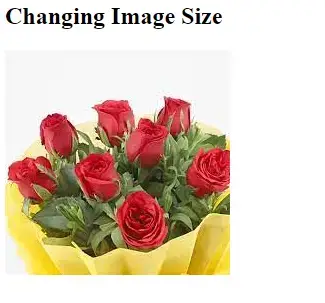
We can use CSS to resize the image above while maintaining its aspect ratio. Consider the following example:
.images {
            display: block;
            max-width:250px;
            max-height:90px;
}
<h2>Aspect Ratio auto </h2>
<img src="/img/jiyik/logo.png" class = "images"/>
We use the CSS class selector image in this code snippet. This class resizes the image to 250x90px without changing its aspect ratio.
In this way, we can set the aspect ratio according to the needs and requirements of our web pages.
We can also change the image with the same aspect ratio. This is mainly done to make the website responsive to all display sizes.
For reprinting, please send an email to 1244347461@qq.com for approval. After obtaining the author's consent, kindly include the source as a link.
Related Articles
Overriding Bootstrap CSS
Publish Date:2025/04/19 Views:80 Category:CSS
-
This article introduces the famous CSS UI framework Bootstrap. We will discuss the process of overriding Bootstrap CSS with custom styles. Bootstrap Overview Using Bootstrap CSS makes it quicker and easier to create responsive websites than
Applying multiple transformations in CSS
Publish Date:2025/04/19 Views:143 Category:CSS
-
CSS transforms are a powerful but underutilized way to add animation effects to elements. However, it can be tricky to get the desired results when applying multiple transformations at once; for example, we want elements to transform in syn
Styling input and submit buttons using CSS
Publish Date:2025/04/19 Views:193 Category:CSS
-
A submit button is a button used to submit data into a form. It is usually placed at the end of the form after all other fields are filled in. When you click the submit button, the form is transferred to the server for processing. The synta
Creating background image gradients using CSS
Publish Date:2025/04/19 Views:164 Category:CSS
-
A background image gradient is a gradual transition from one color to another. Background image gradients can be created using multiple colors, but they are usually most effective when using a limited color palette. This article will teach
Stretchable background images using CSS
Publish Date:2025/04/19 Views:82 Category:CSS
-
This short article is about styling HTML pages using CSS, focusing on styling background images of any HTML element. CSS styles on the web page There are a number of ways to use CSS on your web pages: Inline CSS: Inline CSS means that you u
Gradient backgrounds in CSS
Publish Date:2025/04/19 Views:148 Category:CSS
-
This simple guide is about the use of CSS properties that can be used to define a rainbow-like gradient background for an HTML element. CSS Gradients We can use CSS gradients to display a seamless transition between two or more specified co
First Of Class in CSS
Publish Date:2025/04/19 Views:158 Category:CSS
-
CSS :first-of-type selectors are used to select the first element of its type within a group of elements. For example, if you have a group of paragraphs, :first-of-type the selector will select the first paragraph in the group. This selecto
Bringing an element to the front using CSS
Publish Date:2025/04/19 Views:111 Category:CSS
-
If an element is not set to cover the entire display area, you can z-index bring it to the front using the property. z-index The property determines the stacking order of elements on the page. z-index The higher element is stacked z-index o
Changing the color of SVG elements in HTML using CSS
Publish Date:2025/04/19 Views:83 Category:CSS
-
This simple guide is all about using SVG in an HTML document and how we can customize it to change its color using CSS properties. First, we will take a brief look at SVG in HTML. Introduction to SVG Similar to XHTML, SVG is an XML language